A responsive website design has become one of the most essential aspects to get online success. No matter how effective, attractive, and persuasive your website design and product might be for prospects, if the elements inside the website are not optimized for different types of the screen then all your efforts can go in vain. Today it’s no secret that mobile-friendly WordPress website design can make and break any business that is trying to get more traffic, conversion, and ROI.
Mobile-friendly WordPress websites have become the new norm that allows site owners to drive desired results. Today almost every business and website are aware of the fact that smartphones have outperformed desktop in terms of online searches and the number of searches performed on mobile devices is continuously growing and will continue to grow. But still, most of the site owners are not aware of the value it can bring to the business that is the reason why they keep neglecting making their website design responsive.

If you are looking to create a responsive WordPress website design that drives more traffic and conversion then you have landed on the right article, where we are going to highlight every small detail about what are the benefits of making your website design responsive and how you can make your website responsive for mobile as well as other devices. So make sure you stick to the end of this article.
Table Of Content:
- An Overview Of Mobile-Friendly WordPress Website
- What is a Mobile-friendly WordPress website?
- Why is it important to have a mobile responsive WordPress website design?
- How to make a WordPress website responsive?
- Conclusion
An Overview Of Mobile-Friendly WordPress Website
Mobile users are continuously growing and as mobile devices are getting cheaper the number is expected to increase in the coming future. A responsive and mobile-friendly WordPress website design will allow you to stay competitive and drive the maximum number of audiences, regardless of the device it is getting viewed on. That is the reason why it’s said that mobile responsive websites have become the industry standard.
Gone are those days when mobile-friendly website used to be just a feature, now it plays a key role in getting online success. That is the reason why most of the business today look to hire an experienced WordPress web design company that can help them to create a highly attractive and mobile responsive website design for their business.
Whether you are targeting working professionals or young college students, you need to be aware of their preferences. Today if a user looks to search for any answer or finds any solution, product, and more they always look to access the internet from the nearest device. Mobile and tablets are among the handheld devices that are quickly accessible, compared to desktop or laptop. That is the reason why websites are seeing huge growth in the number of mobile as well as tablet users.

If your WordPress website is not optimized for your mobile devices or if you are running a non-responsive website design then you are losing a lot of your potential customers to your competitor’s website and business. Neglecting to make your website design responsive can hurt your business ROI and revenue badly. Mobile devices have become one of the major sources of content consumption. That is the reason why users look for a dedicated mobile app that they can download and use to read the content.
But even before downloading any mobile app users search for the website on their mobile devices to ensure that they are downloading the right application on their mobile device. If they fail to engage with the content on your website from a mobile device then they will never show interest in downloading your mobile app. Today the responsiveness of the website has become the major factor in defining the company’s reputation, customer base, and improving your website conversion.
Most of the WordPress websites have already started to optimize their website for mobile devices. If you’re still planning this article will surely help you to identify some of the important insights about why it’s important to have a mobile-friendly WordPress website for your business. Apart from that, we will also be giving a detailed idea about how you can make your website design responsive. Let’s start with understanding the basic definition:
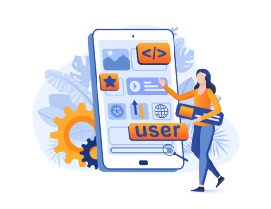
What is a Mobile-friendly WordPress website?
A mobile-friendly WordPress website ensures that the element inside your website is clearly visible on handheld devices and the whole website performs well in every aspect on mobile devices. While creating the mobile-friendly WordPress website designer ensures that users are able to navigate through different pages, easily click on CTA’s, zoom in & out on the screen, and more easily without facing many difficulties.
But still, many websites neglect to make their website design responsive for mobile users. The number of smartphone users is continuously increasing so is the number of searches from mobile devices. A recent stats by Statista states that nearly 52.6% of the website traffic comes from mobile devices and is expected to grow in the coming future. Many mobile users complain that they need to zoom in and out the text inside the website as the letters are not clearly visible.
These types of mistakes not only frustrate your site visitor but also create so bad impression about your website and business. A responsive and mobile-friendly WordPress website design will help you in driving more traffic to your website and create a strong online presence. There are various and popular tools like Google Mobile-Friendly test, GMetrix, and more using which you can easily identify whether your website is responsive for mobile devices or not.
By now you must have a good idea about what is a mobile-friendly WordPress website, next let’s start with exploring some of the important points on why your WordPress website needs mobile responsive website design?
Why is it important to have a mobile responsive WordPress website design?
In today’s tech-driven world where users are looking more toward accessing the internet from handheld devices, it has become essential for site owners to make every small element in their WordPress website design adaptable to all types of screens. A non-responsive website design can impact your website traffic, conversion, revenue, and overall business. Many websites out there that are not optimized for mobile devices have stated that the new customer acquisition rate started falling and the existing customer also stopped visiting their website and making purchases.
Mainly if you are running an ecommerce website then you might see a huge plummet in your conversion rate and an increase in the bounce rate. Because today most of the users are making the purchase from the mobile device and if they fail to find your website unresponsive on mobile devices then they will never show interest in making purchases from your store. Today most ecommerce, as well as service-based websites, are browsed from mobile devices, so running a non-responsive website design can do more harm to your website as well as business.
Most of the time websites that are creating and offering problem-solving content and products fail to reach the right set of audiences because of non-responsive websites. Yes, there are high chances that your website might be getting a good amount of traffic from the desktop device. But you should be familiar with the fact that your website is losing half of the traffic to your competitor’s mobile responsive website. If you are looking to drive more traffic and conversion then it’s essential to have a responsive website.
Well, there are other reasons that you can tell you why your WordPress website needs a mobile responsive design?
1. Mobile usage is at a peak
The reason why you need to have a mobile-friendly WordPress website is that the use of mobile devices is at the peak. A recent report by statists states that today nearly 58% of American adults make use of mobile devices and 55% of the traffic comes from mobile devices. Every month the total number of mobile users is continuously increasing and in the near future, no one can expect a decline in mobile traffic. That your website can get more and more search form the mobile devices.
So if more and more users are spending time on mobile devices then that means they might be looking for your business and website on the mobile devices. If they don’t find you on mobile devices then it can affect your website reputation in many ways. But after finding your website on mobile devices if they fail to interact with the element and other content in the web design then it can break your website as well as business. By not making your WordPress website design responsive you are eventually doing harm to your website traffic, conversion and ROI.
Remember the impression you create in front of your target audience will define whether they will accomplish the final goal after landing on your website or not. A non-responsive website design can drive them away from your website. That is the reason why it’s important for every WordPress website to create and offer responsive design to its target audience
If you are looking to know more about how you can make your website responsive then make sure to consult with our highly experienced WordPress web design company.
2. Optimize user experience
The WordPress website design you create and offer is directly tied to the user experience of your website. Today Google is focused more on offering a more optimized user experience to the searchers that are the reason why they have introduced a separate algorithm for the mobile device. If you are looking to encourage site visitors to explore more about your product and website and also gain their trust then it’s essential to offer responsive design.
By making your website design responsive you will ensure that users are easily able to navigate through different pages, access all the elements, and more. These types of practices enhance your website user experience. When it comes to optimizing the user experience for mobile devices then we recommend paying special attention to visuals. Most of the time visuals that site owners use in their website design become the primary reason for excess bounce rate. Not only that but make sure the CTA button, text, and more are easily accessible on mobile devices.
The more optimized your website will be for mobile users the better the user experience will be on mobile devices. So we recommend you focus more on making the mobile design responsive so that you are able to offer a more optimized user experience. If you need further assistance on how you can make your mobile design responsive then we recommend you to reach out to our highly experienced professional that can redesign your existing website so that you are able to offer a highly responsive and research-based website to your audience.
3. Increase website reach
By making your WordPress website responsive you are optimizing the user experience for both desktops as well as mobile users. This way you are not only improving user experience but also increasing the reach of your product, website, and business. Today with the increase in the number of mobiles as well as tablet internet users, websites have started to drive more and more traffic on their websites. If a user needs any small answer the first thing they do is perform searches on google.
Your product, content, and services might be the solution but to make it reach the right audience you need to make your WordPress website design responsive. Today If you wish to rank on the top in the mobile search results then the user experience and responsiveness will be the major factor that will decide the ranking of your website. Once you successfully place your web pages on the top then more and more audiences will be able to reach your website and business.
If you are among site owners who think desktop traffic is sufficient for your website and business then we recommend you reconsider your thinking. Your potential audience might be searching for your product and services on mobile devices and if you want your website to be their first choice then ist recommended to make your WordPress website responsive. If you need further assistance on how you can increase the reach and awareness of your website and product then we recommend you to consult with our highly experienced WordPress web design company that can help you to create the result-driven strategy for your website and product.
4. Increase in the number of online shoppers
Today WordPress is not only used to create blogging or business websites but it can also be used to run a fully-fledged ecommerce website thanks to different plugins like woocommerce. Well if you are starting new then you must be aware of the fact the number of mobile shoppers is continuously increasing. Whether you are using a custom WordPress website or running a custom-coded ecommerce website if your online store is not responsive for mobile devices then all your marketing and WordPress website design efforts can go in vain.
Today the internet has made it possible to avoid visiting physical stores and make online purchases at cheaper costs. Now within a few clicks users are able to place the order and can get it delivered in a few days. Earlier desktop used to be the preferred choice of every user whether they get to see the large images. But as the internet space started evolving top eCommerce websites started to include various features like HD images, zoom in & out, 360-degree view, and more.
These types of features have made it easy for the user to access the website and get the same experience on mobile devices. So the number of mobile shoppers also started to increase and today mobile has become the first choice of every user. If you are looking to increase the traffic and conversion rate of your WordPress website then we recommend you consult with an experienced wordpress web design company that can help you to make your online store responsive for all devices. If the product inside your ecommerce website is not accessible then you might end up losing your potential customer to your competitor’s website.
5. Improve ranking in mobile searches
Today the responsiveness of the website becomes one of the primary ranking signals that help your web pages to rank on the top in search engine result pages. If you are running your WordPress website for a long time then you must be aware of the fact that website desktop search results and mobile search results differ. That means if your website is ranking on the top in the desktop searches then that doesn’t mean your website will also rank on the top in the mobile search.
To make your web pages rank on the top of the search engine result page you need to follow search engine guidelines for mobile devices. It clearly states that to rank on the top in mobile search websites need to be highly responsive. When you optimize your website from mobile search results then you will automatically be able to engage your website user experience.
Google always gives preference to the website that is offering an enhanced user experience because if users feel satisfied with the result then it will also help Google to make sure search returns for future searches. If you are looking to improve your search engine ranking on mobile devices then it’s always recommended to make the design responsive for mobile users.
Furthermore, if you need more assistance on how you can develop a good, effective, and result-driven SEO strategy that allows your WordPress website to rank on the top in mobile searches then we recommend you to consult with a highly experienced SEO company with more than 10 years of experience in helps different business with creating a strong online presence and get higher ranking in SERP.
6. Trim down Extra Cost
Another reason why WordPress website owners should optimize their design for mobile devices is that it helps in reducing the extra cost that goes into creating a dedicated website for mobile devices and audiences. There are businesses out there who prefer to create a separate website design and layout for mobile devices, if you are doing the same then make sure you are running your business with a good budget. Because with designing cost comes the other cost like SEO, maintenance, and more.
So by creating a separate website for your mobile audience you will be spending the extra amount of money. But by hiring a reputed and highly experienced website design company you can create a highly responsive WordPress website design that will allow you to eliminate the extra cost that goes into creating a separate website from mobile devices. By investing in only one WordPress website design you ensure that your site visitors are getting the same feel of your website on every device.
But with the help of a responsive website, you can easily eliminate the extra cost of developing a new website specifically for mobile devices and also the maintenance cost. Your business needs to only invest in a single site design and make it responsive for all devices so that users are able to get the same experience regardless of the device it is getting viewed on.
If you are planning to create a separate website for mobile devices and desktops then you must be starting with a good budget. But if you want your business to stay competitive in the long run then in the future you might look to cut down extra costs. In the initial stage, you might be able to go through the extra cost like SEO and maintenance but in the future, these costs will surely start troubling you and your business. That is the reason why we recommended you create a mobile-friendly WordPress website design for your website and business.
7. Improve conversion and sales
By now you must be convinced that a responsive website design can help your WordPress website and business in many ways. It helps in getting a higher rank in SERP, increasing the reach and traffic, and more. Not only that but a responsive website design also helps in improving the website user experience. When you’re able to improve your website user’s experience it will automatically help you in optimizing your website conversions and sales.
Yes by making your website responsive you will be improving your website user experience which will also help in improving your website conversion and sales. A responsive website design can result in better visibility in SERP which will allow you to drive more traffic and conversion on your website design. Remember the key to better conversion is optimized user experience. The better users are able to interact with your website design the easier it will become for them to make decisions and become your paying customers.
A responsive website design automatically adjusts the layout of the website depending on the size of the screen and displays all the elements so that users are easily able to interact with your website design. By offering easy navigation and interactive layout you are ensuring that site visitors are easily able to navigate through your website and find the CTA to take action. On the other hand, if your WordPress website is not optimized for mobile devices then users will leave your website without having a second thought. So if you are looking to improve your website sales and conversion then it’s important to make your WordPress website responsive.
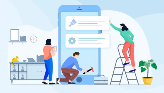
How to make a WordPress website responsive?
Now that you have a good idea about why you need to have a responsive WordPress website for your business. The next thing that we are going to highlight is how you can make your WordPress website responsive. Below are going to list some of the points that will help you to identify how you can make your website responsive:
Start with taking Google mobile-friendly test
Your existing website might look attractive and persuasive on your mobile devices but it’s always recommended to test the responsiveness of your website for different screen sizes to identify whether it’s truly responsive or not. Doing it manually by using a different phone with a different screen size can be a time-consuming process. There are high chances that you might forget or ignore small elements that can become a huge factor when it comes to website design.
That is the reason why we recommended you make use of free mobile-friendly testing tools that allows you to test every small element of your mobile. The mobile-friendly test tool offered by Google is one of the most popular and widely used mobile responsiveness checker tools that will help you to identify whether your website and web pages are mobile-friendly or not. You just need to enter the URL of your website and the rest of the job will be done by the tool.
If your website is optimized for mobile devices then you will automatically get a report on your dashboard with a green color text that says“Page is mobile-friendly”. But if your dashboard highlights red color messages then you need to take a minute to check what’s wrong with your website. Well, the tool gets more advanced for developers as google related Mobile-Friendly Test API using which you can test more number pages quickly and also monitor important pages in your website.
Selecting the right theme for WordPress website
Once you are done with testing your existing website then the next thing we recommend you to do is look at your WordPress website theme. The theme inside your website might play a major role in making your website design responsive. If you have recently downloaded your theme then you might be doing fine with your existing WordPress website. But if you are running your website for a long time then you might need to update or change your WordPress theme.
If you are planning to select a theme for your WordPress website then you must be aware of the fact that WordPress offers a huge library of themes. So before you get started with selecting the right theme for your website the first thing we recommend you do is create a list of features that you want to be present in your WordPress theme. Yes, the responsiveness of the theme should always be present in your list. Apart from responsiveness, you can also add SEO-friendly and fast load time to yoru list.
Make sure you are selecting the right theme for your WordPress website. If you already have a WordPress theme installed then you can look to update the theme by checking your existing WordPress version as well as the theme version. If there are any pending updates available we recommend you start with updating the pending updates. Well, it’s not necessary that your update might make your theme responsive but with the emerging trends, most of the theme providers have started to offer responsiveness features with the theme updates.
You can select a theme for your website or you have another option to get a custom-coded responsive WordPress website design by hiring a highly experienced WordPress website design company for your website and business.
Make use of responsive plugins
The plugin your add to your WordPress website adds functionality to your website. Using the plugin you can add multiple advanced features to your website to make it more accessible, attractive, and engaging. With the help of WordPress plugins, websites are able to add features in the backend as well as in the front end of the website. Things like widgets, CTAs, and more are among the elements on the form end. So when you add these types of plugins to your WordPress website make sure the plugin helps in adjusting the size of the element depending on the screen or allows you to disable your plugin for specific devices.
Elements like sidebars will look good on desktop devices and allow you to add different things which can help you to make your website more engaging on desktop devices. But when it comes to mobile devices the same sidebar that is helping you to enhance user experience on your desktop devices might destroy the user experience on mobile devices. That is the reason why we said the plugin you download should allow you to disable the element on different devices.
Just like the theme, we recommend you pay close attention to the features of the plugin and always look for reviews and demos before you integrate the plugin into your WordPress website. Apart from that when you activate any plugin in your WordPress website we recommend you run a quality check so that you ensure your website is running well on every device. There are few popular plugins that you can use in WordPress websites to make your design mobile-friendly. Below we are going to list some of the popular plugins.
WPtouch
When it comes to making a WordPress website design mobile-friendly then there are few plugins that can help WordPress site owners to make their design mobile responsive one among them is “WPtouch”. If you are running the WordPress website for a long then you must have heard about the plugin with over 6 million downloads called WPtouch. With the help of the WPtouch WordPress plugin, you can create a mobile website from the existing WordPress website with a user-friendly and mobile-centric design and content.
The main advantage of using the plugin is that it allows you to customize or make changes in the design for mobile devices without making any changes to the original website. When you install and activate the plugin in your WordPress website it will automatically create and add a simple theme of your website from mobile devices without changing the overall theme of your website.
That means the content URL and other images in your website remain the same but they become responsive. The plugin ensures that the content inside your website is easily readable on mobile devices. Wptouch is recommended by google so it means using it in your WordPress website can offer you some kind of advantage in terms of ranking. The plugin allows you to include and exclude pages for mobile devices and also control or change the page and menus.
The plugin comes with a free as well as paid version. The free versions offer you access to only a single mobile theme and also offer some of the features like color change, detecting language, and adding elements that help you to match your business and brand. Apart from that the paid version of the plugin comes with more advanced customization features that can help you to make your WordPress website mobile-friendly.
Jetpack
Jetpack is another popular plugin that comes with a bunch of features to help WordPress websites grow in the competitive marketplace. The feature inside the plugin will help you to create a simple mobile version of your website and other solutions will help in growing your website traffic, offer security, and more. There are high chances that you might be using Jetpack for some or another purpose as it comes with an abundance of functionalities.
That means you don’t have to download a separate plugin to make your WordPress website mobile-friendly. The plugin is said to be well maintained as users get updates frequently, ensuring the security and functionality of the plugin. Jetpack plugin comes with a bunch of functionalities like traffic monitoring statistics, grammar suggestions for articles, creating newsletter subscription options on your website, a social sharing button, and more.
Jetpack plugin comes with a free as well as paid version. Well, it’s true that the plugin comes with a bunch of functionalities but if you are a new beginner and recently getting started managing everything from one plugin might become confusing. The plugin will also help in improving the WordPress website speed as it allows you to download the image from the server with the help of CDN imaging.
Apart from that you can easily track your website visitor, automatically post on different social media platforms, easily generate XML sitemaps, and more. Yes, all the features might not be available in the free version of the plugin however you can opt for the paid version of the Jetpack plugin to get access to these advanced features.
Conclusion
By now you must have a good idea about why it’s important to have a responsive WordPress website design for your business and how you can make your WordPress website responsive for mobile devices. Remember when it comes to WordPress then the themes and plugins in your website will play a major role in defining the success and failure of your website on different devices. That is the reason why most of the websites have started to opt for custom-coded WordPress website design so that the whole website design and layout are easily adaptable to different screen sizes.
If you are looking to create a custom-coded WordPress website design for your business then we recommended you hire an experienced WordPress website design company that can help you to create an attractive, responsive, and conversion-centric website design that drives more organic traffic and conversion.