Facing difficulties in deciphering your Google analytics data and reporting it to your clients? If yes, then don’t worry Google Data Studio has got you covered.
Many marketers around face difficulties in accessing, understanding, and visualizing google analytics data. Because of that most of them fail to report back to their clients with authentic and reliable data. Well, data is something every client-aspect from successful marketing as well as website design companies.
Today having data is not as difficult as it used to be in the early days. Thanks to the various analytical tools available. But understanding, analyzing, and visualizing those data makes it easy for an organization to get an insight into their client’s business.
If your marketing and website design company offers the client with all the valuable analytical reports and data embedded into excel spreadsheets then we have a piece of good news for your organization.
Like other tools, Google is offering a valuable tool called Google Data Studio that is part of the Google Analytics 360 suite. There are other paid tools available but their price makes it difficult for small and medium-sized businesses to buy and access those tools. Google Data Studio is a free tool that can be accessed by all types of businesses.
In this article, you will be able to determine What Google Data Studio is and how you can use it to offer the best data overview. First, we will help you with the basics of Google Data Studio (as it is hard to understand). Next in the final step, we will give detailed information on how to access advanced options.
If you are looking to know the upcoming google algorithm update then check our blog on Google Upcoming Algorithm Update: Core Web Vitals To Improve Page Experience
What is Google Data Studio?
Google Data Studio is one of the most effective and efficient reporting tools that allow you to convert your client’s analytics data into easy to understand and informational reports through data visualization. You can easily customize, access, and share the report through google data studio to your clients as well as to your in-house team. In simple words Google data studio allows you to convert your analytical and search console data into reports that can be easily accessed and deciphered by any human.
How To access Google Data Studio?
1. Login to Google Data Studio
First and Foremost step involves creating an account with Google Data Studio to access the dashboard. It is always recommended to use a similar account that you are using to access Google Analytics or Search Console or Google Ads.
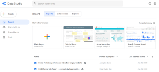
Once you successfully create the account you will land on the Google data studio dashboard where you can find Create option on the right side and different templates.
2. Google Data Studio Dashboard Features
The dashboard appearance is very much similar to google docs and spreadsheets. After accessing the Dashboard you will find Create Option in the right top corner. Once you click on that then you will get three options to select Reports, Data Source, Explorer.
i. Report
In this section, you can create as well as access all the reports. Not only that but you can filter and select the type of report (All, owned by me, Shared With me)
ii. Data Source
Data source allows you to check all the connections between the data studio and the original data source. Google Data Studio supports 500+ data source few of them are listed below:
- Google Ads
- Search Console
- Google Analytics
- Youtube Analytics
- Extract Data
- Display and Video 360
- Big Query
- Campaign Manager
- Google Sheet
- Search Ads 360
Whether you are using Google analytics or search console it is always recommended to connect it worth Google data studio to avoid offering ambiguous reports. Connect each view and property individually. If you have google analytics views for the different domains you need to connect them individually that means you need to create a different data source for each view.
iii. Explorer
From the term, you can easily figure out it’s functioning. Explorer allows you to experiment with your chart without making changes to the actual report. For example, if your report contains data about the conversion rate for the particular web page and you wish to add the data about clicks on that particular page.
You don’t have to access the report section to experiment with the data. Instead, you can transfer it to your lab (Explorer). You can add the data and check its effectiveness. If you think that changes made can add more value to the report then you can save and transfer back to report or delete the data.
iv. Report Gallery
It allows you to access different templates and examples offered by Google Data Studio.
v. Connect To Data
In this section, you can add or connect data sources like google ads, analytics, search console, and more. Google analytics and search console are the basic free tools that every website uses.
So the question is how to connect data sources with Google Data Studio?
Once you select the Google Analytics or Google search console you will find an Authorise button. Click on the authorize button to grant permission. Next after authorizing, you have to select the account, property, and view (As shown in the figure).
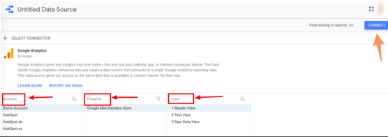
After selecting all those fields click on the Connect button in the top left corner. Beside connect, you will find an option called “Field editing in reports” you can leave it On. But if you are sharing the data with the client and colleague where you don’t want to grant full access then you can turn it off.
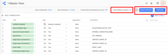
After completing all the steps you will be directed to the view page. There you can find the list of all menus/fields that you have in your analytical account. In this particular step, you can access all the fields, add new fields, duplicate the current one, and more but it is recommended to do it from the report editing section.
To create a new report from the data, In the top right corner, you will find Create a new report option click on it. Till now the steps were simpler but next, you have to be attentive while creating the report.
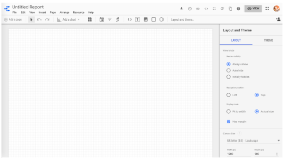
After clicking on Create New Report you will find a blank page with various editing tools. In the Right sidebar, you can edit the layout and theme. Next Click on the “Add a Chart” to add different charts in your reporting. In the add a chart drop-down menu you will find various options like pie, bar, table, time series, and more.
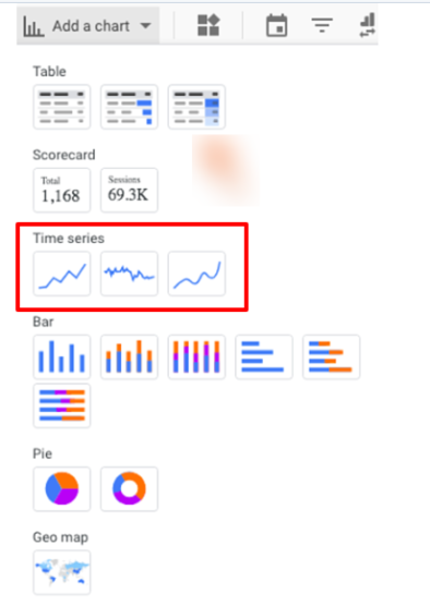
Depending on your requirement you can select any option. If you add time-series then you show changes over time in your reports. Whenever you add a chart in the report you can make changes from the right sidebar.
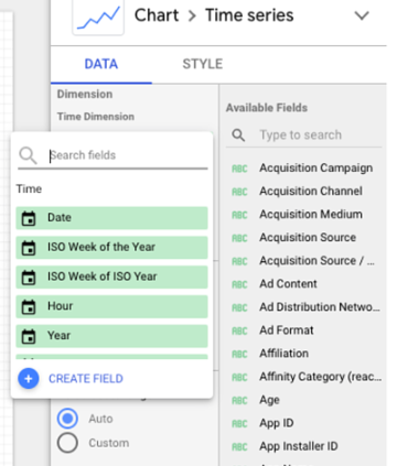
For example, if you are selecting time series then the right sidebar allows you to change the time-based dimension including year and hour. Google data studio automatically defines the metric which you can easily change or add it from the right-hand sidebar.
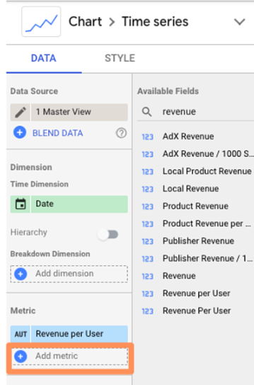
If you wish to add metric or dimension manually in your time series chart then you can do it either by clicking on the “+” sign in add metric option or you can do it by dragging and dropping the fields from the right section.
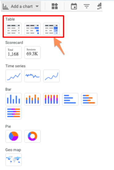
If you wish to add the table in your right bar then follow the same process
- Navigate to the “Add a chat” Option
- In the dropdown menu, you will find Table option click on that
- From the right sidebar, you can edit the changes
- You can add new fields, reduce row per page, Change the dimension and metric
- After making changes to data next you can click on Style to add border-color, shadow, and more.
After making the changes and adding all the products next you can view your report by clicking on the View option in the top right corner.
By now you might be having a clear idea about what Google Studio is and how you can create and access it. Google Data Studio is not limited to that there are a lot of tips that a bigger person should know before creating a report on Google data studio.
Tips every new beginner should know before accessing Google data studio
1. Make Use of Pre-built templates
If you have arrived on the Google data studio dashboard then one question might be troubling you how to create an attractive report. Don’t worry you can make use of pre-built temples that are available in the dashboard as well as in the community section. You don’t have to restart everything from scratch.
There are many templates built by the Google Data studio team that you can find in the Marketing template section. Not only that but you can make use of the User-submitted template from the community section. Below we have listed some important templates that you can use to create the report in Google Data Studio.
- Google Analytics Marketing Website
- Paid Channel Mix Report
- GA Behavior Overview with data control
- Website Technical Performance Indicator
- To access more reports you can go to Google Studio Report Gallery
Google Studio Report Gallery gives access to all the marketing as well as the non-marketing template.
2. Connect to different data sources
In the beginning, we mentioned you can easily connect Google Data studio with different sources like search console, Google Analytics, Google Ads, and more. Other than that Google Data Studio allows you to connect with other third-party resources like Bing Ads, Amazon Ads, Adobe Analytics, AdStage, and more.
3. Craft your report
Yes, there are various pre-built temples available that you can use in your report but other than that if you wish to create a simple report then you do it by accessing tolls in Google Data Studio. In the previous section, we mentioned how to create a report from scratch using the same procedure to land on the New report section.
From the right sidebar, you can access the Layout to adjust and edit the style and formatting of the report. In the Theme section, you can select the Custom in the dropdown menu and change the primary, secondary color, font as well as text color. If you are finding it difficult to create the report then you can always reach out to us. Make use of the layout and theme option to make your report look more attractive and appealing.
4. Add Elements in your Report
Google Data Studio allows you to embed URLs. Using this feature you can easily add Google doc link, sheet, and youtube videos link. Offering this type of reporting is far better than passing screenshots in the report. In the upper navigation bar, you can click on Insert then select the URL embed option to insert a link.
Embedding these types of links allows you to take you to report viewers’ reviews, tell them what you report is about through video content, and allows you to personalize the report by pasting the links of your website, blog, or the product page.
5. Schedule your report
One of the attractive features offered by Google Data Studio is report scheduling. There are times when your organization has to report to clients weekly monthly or daily. Scheduling reports can be the best way to fulfill your client’s needs. In the top menu bar, you can find a clock symbol, click on it to schedule the report. To schedule, the post enter recipient email id then selects the date and month to schedule your report.
6. Easily Download and Embed report
Google Data Studio allows you to easily download and embed the report you created on a data studio. Wherever you need the PDF copy of your report you can easily download it from Google Data Studio. Navigate to the top menu bar and click on the down-facing arrow to download the report.
If you wish to embed the report in your blog post or your companies portfolio then you can do it by clicking on the bracket icon in the top menu bar. After clicking on the symbol you will get two options to select embed code or embed URL. depending on your requirement you can make use of the code and URL of your report.
Tips for Intermediate Users
1. Include Data range
Allow your visitors to access your report and select the date from when they want to access the report. If your report displays data about the last 30 or 90 days then let your user select the date. You can easily add the date range option in your report by navigating to the calendar symbol on the top menu bar. Follow the below steps to add data range in your report:
- Click on the calendar symbol in the top menu bar
- Next, a box will appear on your report, place it in the right position
- From the left sidebar, you can access the data range properties
- Select auto data range option from the drop-down menu
Next, if you want your report to get updated depending on the date range selected by the user then you can do in two ways:
- Define or set the period so that it always replaces the data range control.
- Next, you can group the chart that should be applied to particular date range control. (You do it by selecting the chart, next navigate to arrange option and click on the Group in the drop-down menus.
After completing those seating make sure to test your chart so that when the customer selects a particular data range they don’t find the same data for that particular selected data range.
2. Include Filter control Option
Providing Filter Option enhances the report and makes it easy for the audience to view specific data. For example, if someone tries to access the total number of clicks in the report, the filter option allows them to get specific data.
From the top menu, you can add the filter. Once you click on the filter option, a filter bar will appear in the report. Resize and position the filter option on to the right or left corner to make it visible to the user. A panel will appear on the left side that will allow you to add and edit the filter option.
3. Include data control
Using a data control feature you can easily allow your stakeholders and different teams of your company to view and choose the source of data. You can create different sets of data in your report and from the data control tab, they can easily select the type of data they want to see. Once they click on a data view the whole chart will automatically get updated.
Just you have to click on the data control widget icon in the top menu bar. Then form the Data control properties, you can add the widgets and showcase different data in your report.
4. Include Dimension Breakdown
Adding dimensional breakdown in your chart allows you to make your chart more informative. Whether you are displaying referral links or organic traffic getting access to in-depth reports helps users to better understand the report. Organic traffic can be from different countries and referral link data can be from single or different sources.
Including dimensional breakdown allows you to create a separate bar for each source. You can navigate to the data section on your right sidebar. In the dimension section filter by medium and click on + sign to add dimension and metric.
5. Data Studio Explorer
While explaining different aspects of the Google data studio we highlighted what is the use of Explorer. You can easily bring your chart into Explorer. Click on the three vertically stacked dots that you will find in the top right corner. Then hit the Explorer option.
In the explorer tab, you can easily add and modify dimension metrics, data range, and more. Make sure to save the changes. Like other Google tools, the data studio doesn’t save the changes automatically. Once you click on save all your data will be saved in the explorer section as the default report.
You can also access the explorer directly from the google data studio dashboard. Click on explorer than in the next tab you can click on + symbol on the bottom right corner. From there you can start adding editing the report.
Advance Features
Other advanced-level tips can help you to enhance your Google Data Studio report. Below we have mentioned all the advanced features offered by Google Data Studio.
- Google Data Studio allows you to create report level filter
- Using 400+ data sources you can blend all the data into one report to make it more accessible and informative.
- There are times when existing data doesn’t offer in-depth information. That’s when you can create a basic calculated field to offer more informative reports. The calculated field makes use of your data to calculate and offer more accurate results in your report.
- Google data studio advance feature allows you to create data sources as well as chart level calculated fields.
- If you are aware of the function that you use in Excel and Google spreadsheets then accessing and adding an advanced calculated field will become easier.
- You can also create calculated blended field in your report