Checkout Page optimization is one of the underrated processes in e-commerce website design but the most effective ways to drive more conversions and sales. Today more than 70% of the shoppers abandon the cart after facing various problems during the checkout process.
So the question is why users abandon the cart during the checkout process?
Most of the eCommerce websites focus on optimizing their website appearance, navigation, product appearance, site experience, and more. Yes, these are important aspects of a successful eCommerce website design.
Because when shopper lands on your eCommerce website, your first impression will encourage them to explore more products and services. But if you want them to make a successful purchase then you need to have an optimized checkout page.
Checkout page optimization reduces the chances of losing customers and sales. Don’t worry you don’t have to buy any tools or software to optimize your checkout pages. We will help you to resolve the issue of abandonment cart. It can be easily resolved by making small changes to your checkout page.
In this article, we will help you to determine, the difference between one-page checkout and a multi-step checkout page, and different ways to optimize the checkout page to drive more conversion and sales.
If you are looking to reduce post-purchase dissonance of your eCommerce website users then check our blog on 6 Efficient Tips To Reduce Post-Purchase Cognitive Dissonance
What is a Checkout Page?
It refers to the pages on the eCommerce website that appear during the customer’s final product purchase. The eCommerce checkout page is similar to the physical checkout that most of us do in the physical store. But in eCommerce checkout page customer provides shipping address and personal details.
Checkout pages are categorized into two parts: one-page checkout and multi-page checkout. So let’s dive in and see what is one-page and multi-page checkout and which is better for an eCommerce website.
“About Us: SFWP Experts is an award-winning San Francisco website design company specialized in offering conversion-centric custom web design services to all sizes of businesses. Our professionals can create highly effective and fully responsive eCommerce as well as a standard website. We at SFWP Experts have a team of content writing and marketing experts, dedicated to delivering high-quality and fact-based content to educate our audience about the latest trends, tools, tips, and more.“
One page vs Multi-Step Checkout Page
From the terms, you can easily identify that one step checkout includes all the necessary elements like billing, shipping address, payment info, and more on the same page. And allows users to complete the checkout process on the same page. Whereas Multi-step checkout has different checkout pages for different elements. In recent years, a one-step checkout process has started to grab many eCommerce site owner’s attention. So let’s dive in and see what’s the advantage of using One page and Multi-step checkout process.
One Page Checkout Advantage
- Compared to Multistep its faster. Using One-page checkout for an e-commerce website doesn’t reduce the checkout process elements but it’s on a single page which makes it easy for the user to fill all the details and saves time.
- It allows you to persuade the user by offering fewer checkout elements on the same page. Ecommerce is all about offering a satisfactory experience to the user. One-step checkout process allows the user to know how many steps they have to fill to complete the purchase. Fewer steps encourage them to complete the purchase and visit again on your website.
- Offers Navigation less experience. As all the checkout elements are on the same page, your visitor doesn’t have to navigate to other pages to changes or edit their information all can be done on the same page (sounds persuading right?)
Multi-Step Checkout Process Advantage:
- It allows you to collect data from users. The multi-step checkout process allows you to collect user data in different steps. Even if your customer fails to make a purchase then also you will be having their data like email to contact them. For example, if your first page is about asking the user to offer their email address and on the next page you customer abandons checkout process, you will still have his/her email address to send abandoned cart email.
- In multistep checkout, you don’t have to focus on design and add too many UI elements to grab their attention. Users know that it is meant for collecting their details like shipping addresses, personal details, and more so they don’t expect too many design elements. Instead, a simple layout with minimalistic design can be more effective.
How To Improve Checkout Page Conversion?
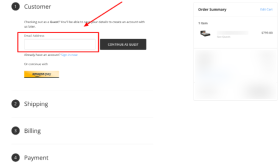
1. Get your site visitors Email Address
Most of the eCommerce website owners think once their visitor adds the product they will surely make the purchase. If you are among them then its time for the reality check. In reality, only a few customers make a successful purchase after adding the product into the cart or into your check out page.
That’s why it is always recommended to capture your guest email address. Our e-commerce website design professionals focus on creating an eCommerce website that allows site owners to collect visitor email addresses as early as possible. Email adders allow you to contact your customer even after they abandon your cart.
Don’t force your site visitor to create an account instead you can ask them to enter their email address then select how they want to checkout, as a guest or account holder. Because 35% of the visitors don’t feel comfortable in creating an account on their first visit. Yes in their second purchase they can think of creating an account but it depends on how satisfying their experience was.
If you don’t have your visitor’s email then it will not be possible for you to create and send an abandonment cart email to drive them back on your website. So, if you want to improve checkout page conversion and sales then start collecting your visitor’s email id.
2. Keep your checkout page short and simple

At the beginning of this article, we mentioned a short checkout page encourages the user to buy the product. 28% of the customer abandons that cart after watching a long checkout process with too many options to fill. That’s why it is recommended to create short and simple checkout pages that persuade them to buy your product.
So the question is how to create a simple checkout page?
Whenever a shopper tries to add the cart item into the checkout page ask them whether they want to continue as a guest or create a new account. Don’t make your checkout page bulky by asking too much information about your shopper.
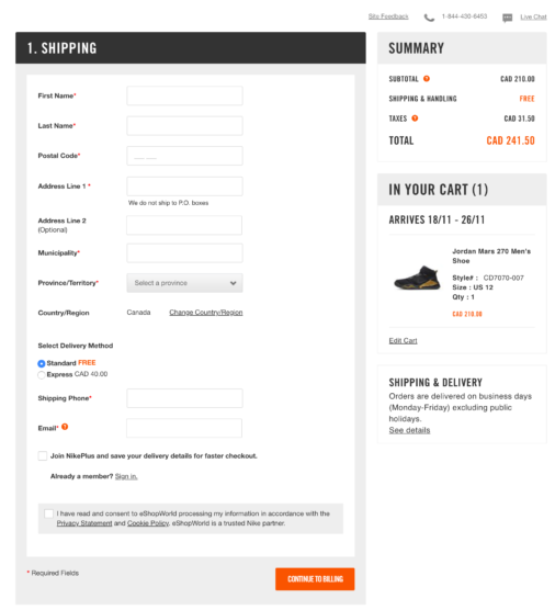
If you are using the one-step checkout process then you can add shipping details (name, address, email, and phone number) and payment details. To make your checkout page more conversion-centric you can add features that auto-detects the location by zip code.
Don’t make your shopper fill every detail individually instead use autofill form data that is pre-stored in browser to get the details of users. If a user has an account on your website then store all the necessary data like shipping details, name, number, and more. You can also ask the user to save their card details for a faster checkout process.
These type of small features attracts user attention. Mainly if you are a small online business that is aiming to grab more shoppers onto your website then you should definitely make use of these features.
3. Don’t add too many distractions

Creating a well-focused checkout page automatically optimize your conversion and sales. Most of the time e-commerce website owner commits a mistake by adding product recommendation or other links that distract aways shopper from the checkout page.
Mainly links in your header and footer drive away shopper from the checkout pages. Well, you have to understand that there are two kinds of shopper ones that look for a specific product and purchase that product. Whereas there are a group of shoppers who like to explore more about other products and based on the feature & quality they purchase that product.
If your checkout page has too many distracting then the second type of buyers will never hesitate to check other products that you recommend on the checkout page. There are chances that they may end up buying nothing.
That’s why it is recommended to create a checkout page that only offers information about refund, shipping rate, delivery time, and your terms/policy. Don’t add too many extra elements and links that can distract your audience away from the checkout page.
4. Allow shoppers to access cart page from the checkout page
If a shopper adds the product into the checkout page then that doesn’t imply that they seek to buy only one particular product. There are chances that a shopper might have added multiple products on their cart page. Most of the time it happens shopper likes the product, adds the product into the cart, and forgets to add it to the checkout page.
To increase your check page conversion it is recommended to display your cart products in the checkout page as shown in the image. It reminds them that there are other products that they have liked and added in their cart. You can also create a continued shopping page on the checkout page. Implementing these techniques on the checkout page helps you to increase your sales and conversion.
5. Offer multiple payment options to shopper
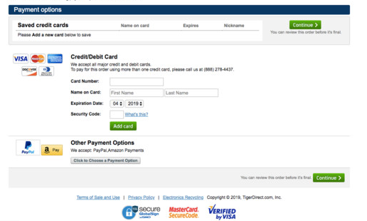
In recent years, our marketing experts have determined that offering multiple payment options encourages users to perform the final purchase. More than 8% of the shoppers abandon the cart because they don’t find the proper payment option to purchase the product.
Offering various payment options makes it easy for the user to make payment for that particular product and persuades then to take action. There are different popular payment options like PayPal, cash, credit cards, debit cards, net banking, and many more that you can include in your checkout page.
6. Mention Return Policy and Free Shipping in the Checkout page
Clearly mention your return back policy on the checkout page. Many times it plays a crucial role in persuading users to buy your product. Today most of the shoppers come across bad experiences like seeing something and getting something else.
Your return back policy can assure them that if the product is not up to the mark then they can easily place the return request. In addition to that, you can mention when they can get the amount refunded back after returning the product.
If you are selling virtual products then also you can make your checkout page more persuading by offering you shopper 20 or 30 days guarantee to return back option. There are many SaaS selling platforms that are using these techniques to encourage customers to successfully make a purchase.
7. Make Your Customer Feel Secure
Security is what every new, as well as savvy shopper, cares about. If you are looking to optimize your checkout conversion and want users to buy the product then it is essential for you to offer a safe environment. Today every online shopper is aware of the data leakage like phone number, email address, card number, and more shared by other companies.
To encourage shoppers to offers their details and make a successful purchase you need to assure them about safety and security offered by your website. There are a few ways like you can add the safety seal (HTTPs or SLL certificates) at the top in your URL.
A small sentence under email “Your data is secured we don’t share details with other platforms checks our privacy and policy” will surely offer relief to your shoppers and encourage them to buy your product
8. Create Urgency and ask the shopper to take action
While surfing your eCommerce website every shopper knows that they have time and sometimes shoppers spend a lot of time finding products and leave the website without making any purchase.
Not only that but there are times when shoppers add the product in cart and leave the website thinking that tomorrow or day after that can make the purchase. To be frank that tomorrow never comes. That’s why it is recommended to create urgency in the checkout to encourage shoppers to take action.
If your shoppers are interested in buying your product and if they find that the stock is limited then they will not hesitate to take the action immediately. You can also create a deadline popup or offers an incentive to persuade shoppers to buy the product immediately.
Those pop-ups can appear when a shopper navigates to the close button on the checkout page. There are many eCommerce websites that are using this type of pop-ups and limited stock urgency to push their customer to buy the product.
Conclusion
By now you might be aware of the importance of the checkout page for an eCommerce website design. Your website design can attract shoppers’ attention but if you want them to purchase your product then start offering an optimized checkout page.
A small glitch and distraction in your checkout page can drive away your shoppers. Whereas a sales focused checkout page help you to drive more conversion. We have mentioned all the necessary steps that can help in your optimization process.
However, make sure to check whether the changes you are implementing is giving you impactful results or not. To do that you can make use of feedback back forms and ask your customer about the purchase experience.
If you want to make your checkout page more effective then you can always reach out to us without any hesitation. You can consult with our eCommerce experts with 10+ years of experience in offering conversion-centric eCommerce website design.
Frequently Asked questions
1. What is a good checkout conversion rate?
3% is considered as the average conversion rate for an e-commerce website. That means if 100 customers are visiting on your eCommerce website then 97 customers bounce back without making any purchase.
2. How do I optimize checkout on Shopify?
If you want to optimize your Shopify checkout page then you can make use of below tips
- Make you CTAs clearly visible without any distraction
- Use urgency trigger to persuade customers to take action (count down timer to the checkout page)
- Highlight the progress bar
- Use one-step checkout pages
- Highlight the shipping as well as the return policy
- Keep your checkout page simple and short
- Get you to site visitors email id
3. What is one-page checkout?
In simple word one-page checkout allows the site owner to display all the elements of the checkout process like shipping details, personal details, and payment details on one page. One page checkout allows users to access the whole checkout elements within a few clicks. it saves the user time and encourages them to buy the product.
4. Is one-page checkout effective?
Yes, there is no doubt that one-page checkout is much more efficient and effective than multipage checkout. In one-page checkout, users can easily find the details that they have to fill before buying the product. In multi-page check out most of the shopper abandoning the cart either in the second or third step/page.